OPAL-RT – New brand identity for the international company
Client: OPAL-RT
Branding
Web
Communication
B2B
Globally recognized for its real-time simulation solutions used in the development, testing, and validation of complex systems, OPAL-RT is updating its visual language with a refreshed brand identity.
Strategic groundwork to evolve the brand
Macadam led an in-depth strategic initiative to better identify the brand’s key growth levers. Through exploratory workshops, the team helped define the company’s core identity pillars and facilitated a collective reflection on its positioning. The process was enriched by a targeted survey and several one-on-one interviews with employees, partners, and international clients. These insights helped paint a clear picture of current brand perceptions and reveal OPAL-RT’s distinctive attributes.

An evolution rooted in continuity
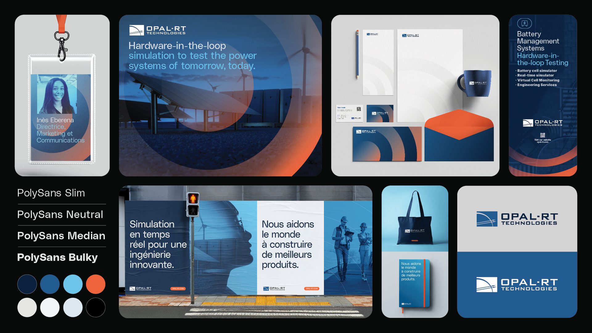
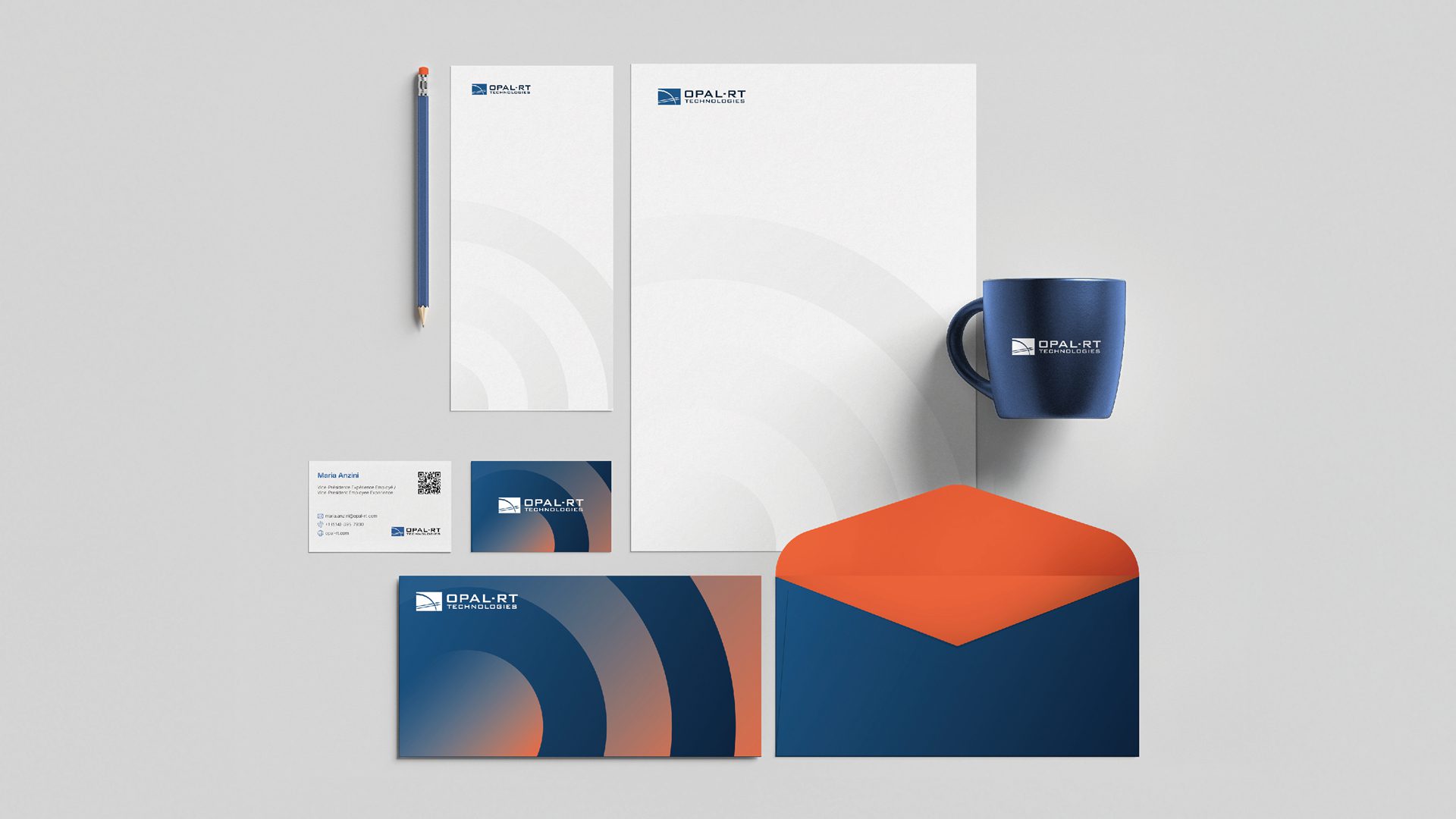
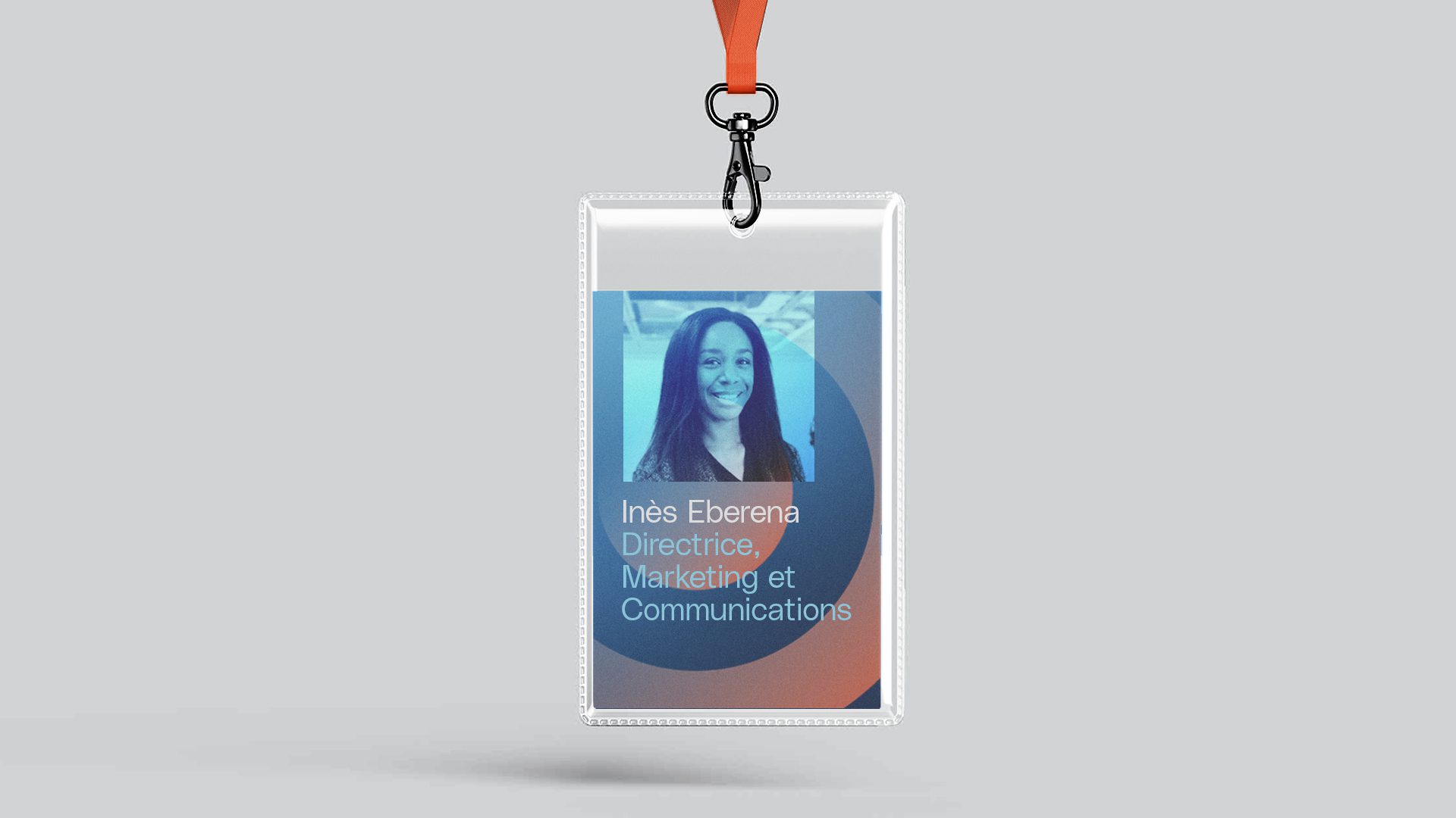
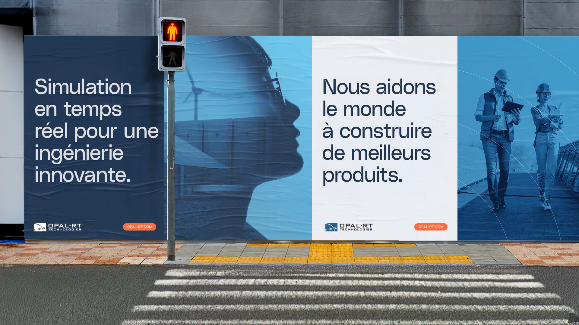
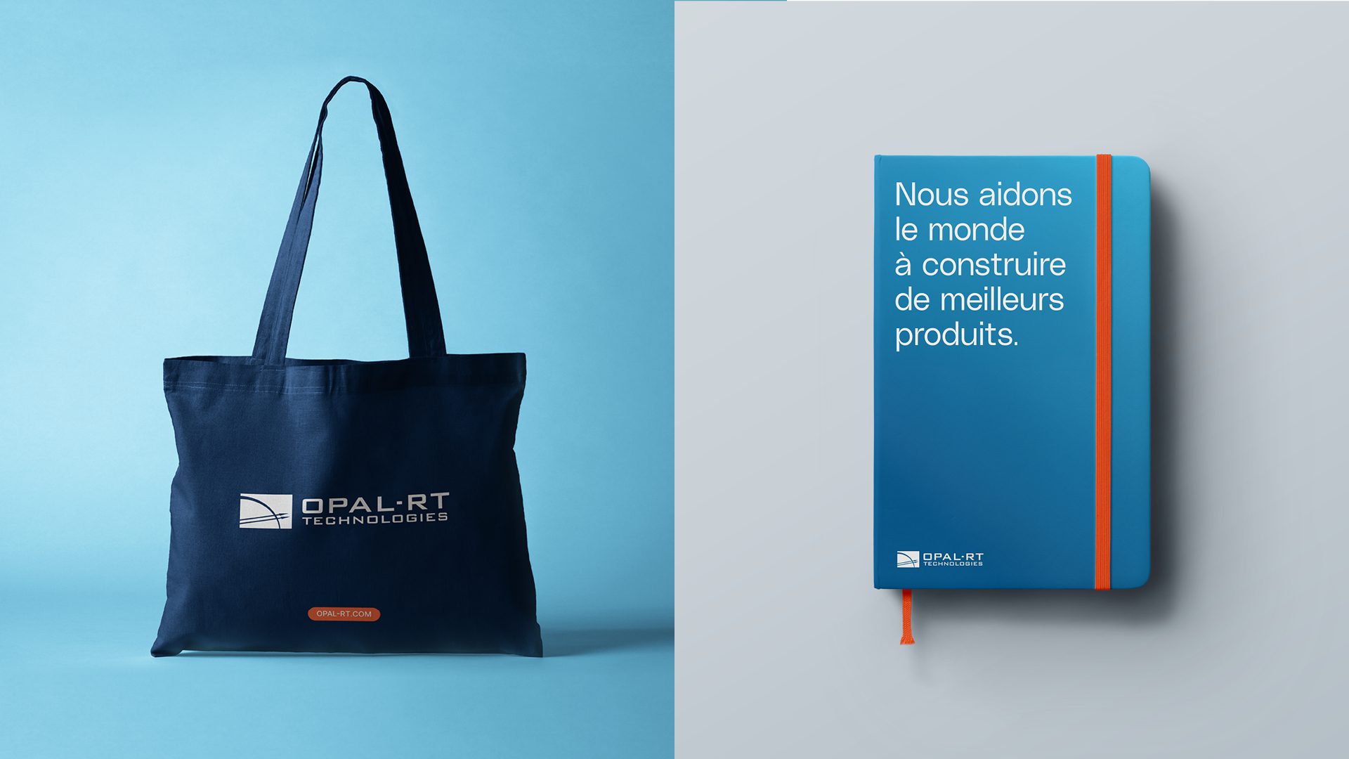
While the OPAL-RT logo remains unchanged, the focus was placed on refining the graphic system. The updated color palette keeps blue as the primary hue—symbolizing reliability and expertise—while introducing orange as a warm, distinctive accent. The new typographic duo, PolySans and Inter, brings a modern edge, balancing clarity and personality. The photographic style was also reimagined to better express the dual nature of OPAL-RT’s world: cutting-edge technology and the people driving innovation.
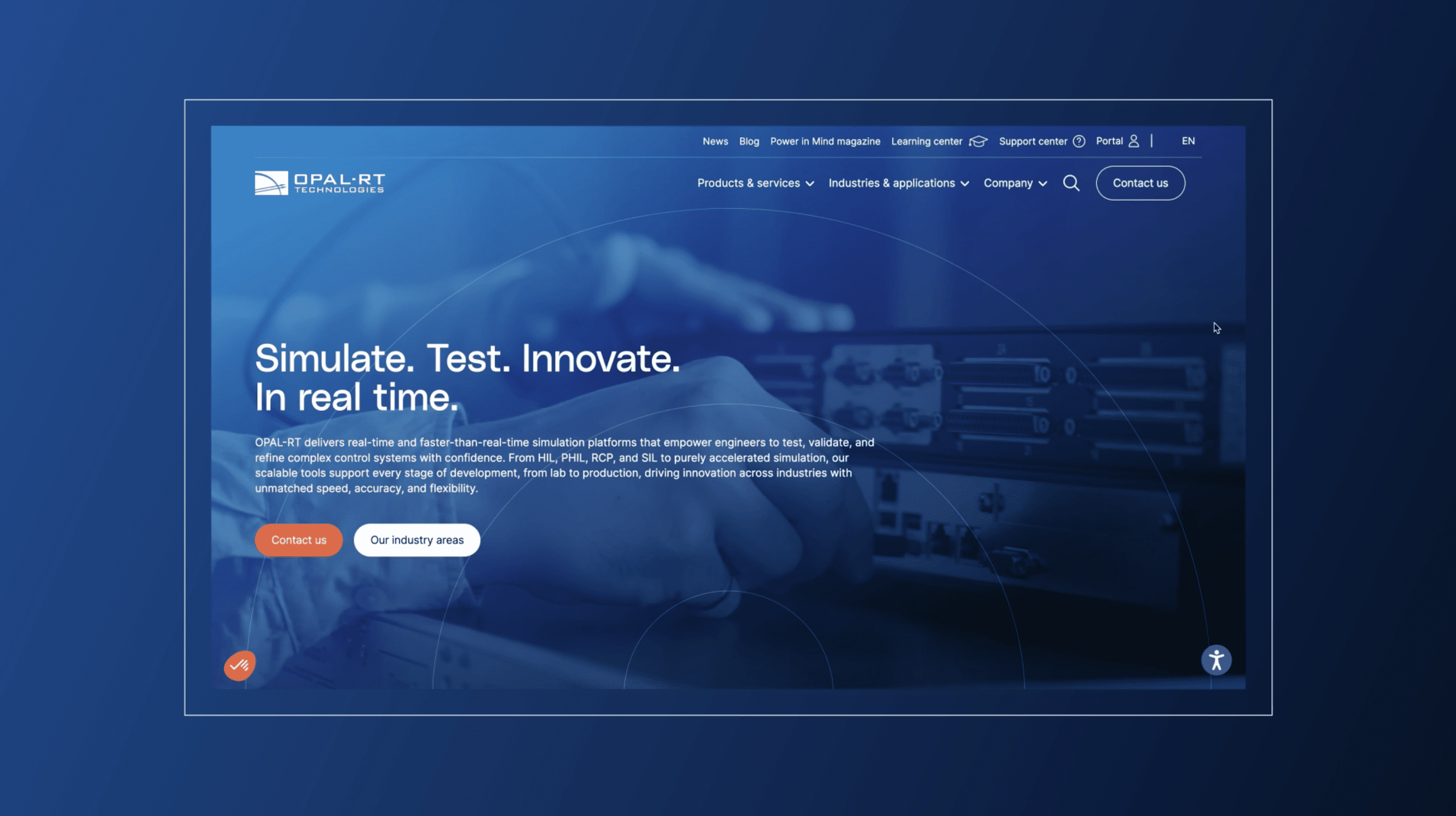
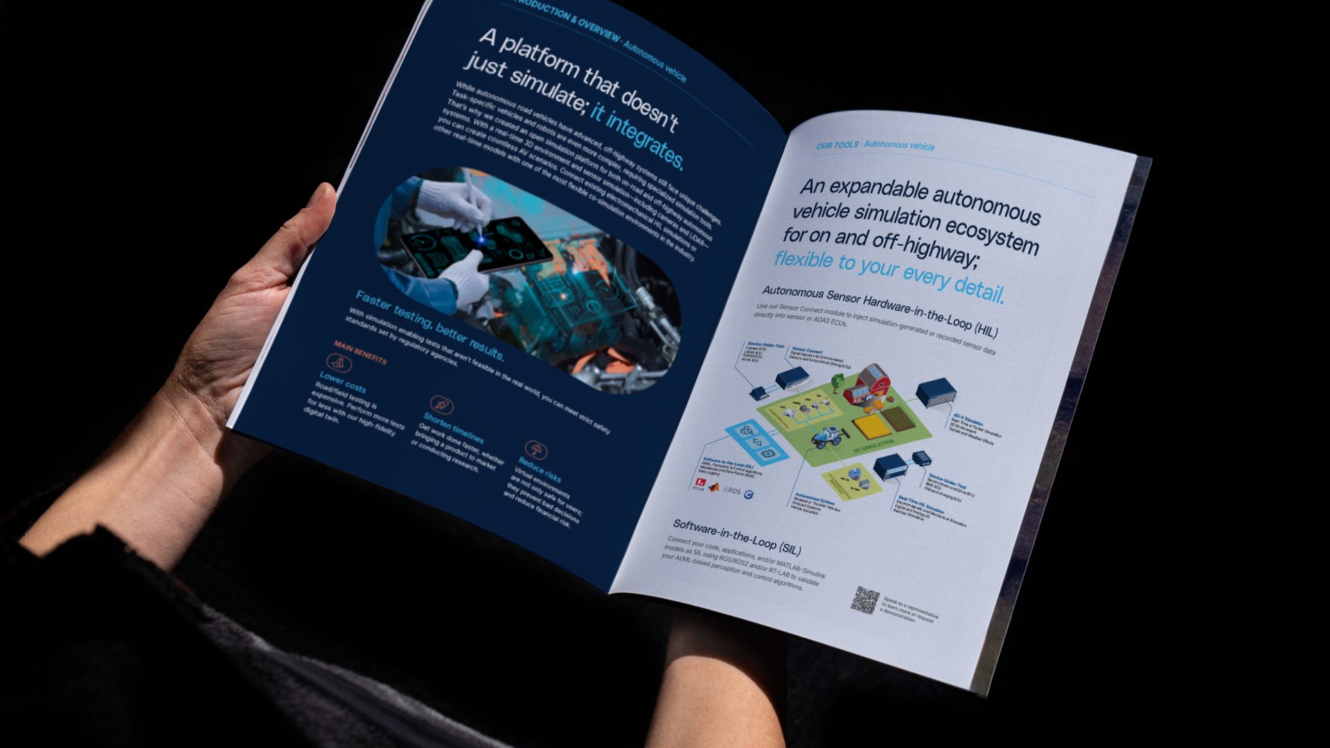
The new visual system is built around a more rigorous grid, graphic elements inspired by the world of simulation, and a clear content hierarchy that enhances both legibility and brand consistency. This refreshed identity is applied across a variety of touchpoints: business cards, brochures, trade show booths, digital visuals, internal communication tools, and a complete website overhaul executed in collaboration with digital agency TREIZE.
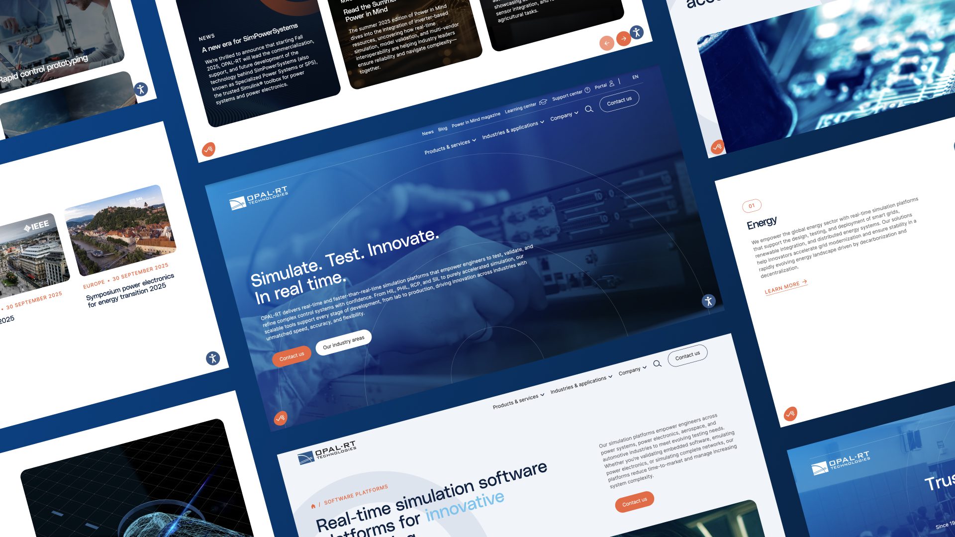
A close collaboration between Macadam x TREIZE
This large-scale project brought together a wide range of expertise—from digital strategy and UX/UI design to custom development, SEO optimization, and deployment—to deliver a seamless, intuitive user experience aligned with the new brand platform.
The website architecture was designed to showcase the breadth of OPAL-RT’s products and services, while ensuring a clear and consistent navigation. The multilingual site includes advanced functionalities such as a multi-criteria filtering system for the product catalog, layered search powered by Algolia, and CRM integration for forms and lead scoring.