Univesta Assurances – Brand repositioning and brand platform
Client: Univesta
Branding
Web
B2B
B2C
One of Quebec’s leading property and casualty insurance brokerage firms, Univesta Assurances is entering a new phase of its development. The company wanted to strengthen its awareness and better define its role in an ecosystem where the lines between insurer, agency and broker are increasingly blurred.
A tension brought to light
The process was built on a market analysis, strategic workshops and interviews with key members of the organization. A tension quickly emerged: a company recognized for its expertise, but a brand that had stayed too discreet. A gap between the value delivered and the value perceived.
That tension had to be resolved with two audiences at once, personal and commercial clients, and the talent of an industry facing a labor shortage, where the appeal of the employer brand has become a growth issue in its own right.
Choosing the opposite path
In a market dominated by promises of price and speed, insurance is increasingly treated as a commodity. Univesta chose the opposite path: returning to the value of brokerage itself, the value of judgment and advice, with a more committed stance toward its clients.
The repositioning hinges on a clear shift, moving from the role of transactional intermediary to that of frontline advisor. Where the market standardizes, Univesta claims the value of analysis, counsel and defending the client’s interests. This is not a service promise; it is a reassertion of the broker’s craft, at a moment when the industry tends to reduce it to a distribution channel.
A tagline that reverses the logic
From this stance came the signature “Ce qui compte pour vous, compte pour nous” (“What matters to you, matters to us”). It puts the positioning into human language: a broker doesn’t sell a policy, a broker takes on what the client is trying to protect. The wording performs a deliberate reversal, what comes forward is not Univesta’s products, but the client’s priorities, which the company makes its own. A line that commits the internal teams as much as it shapes the client relationship.
An expression that lives up to the positioning
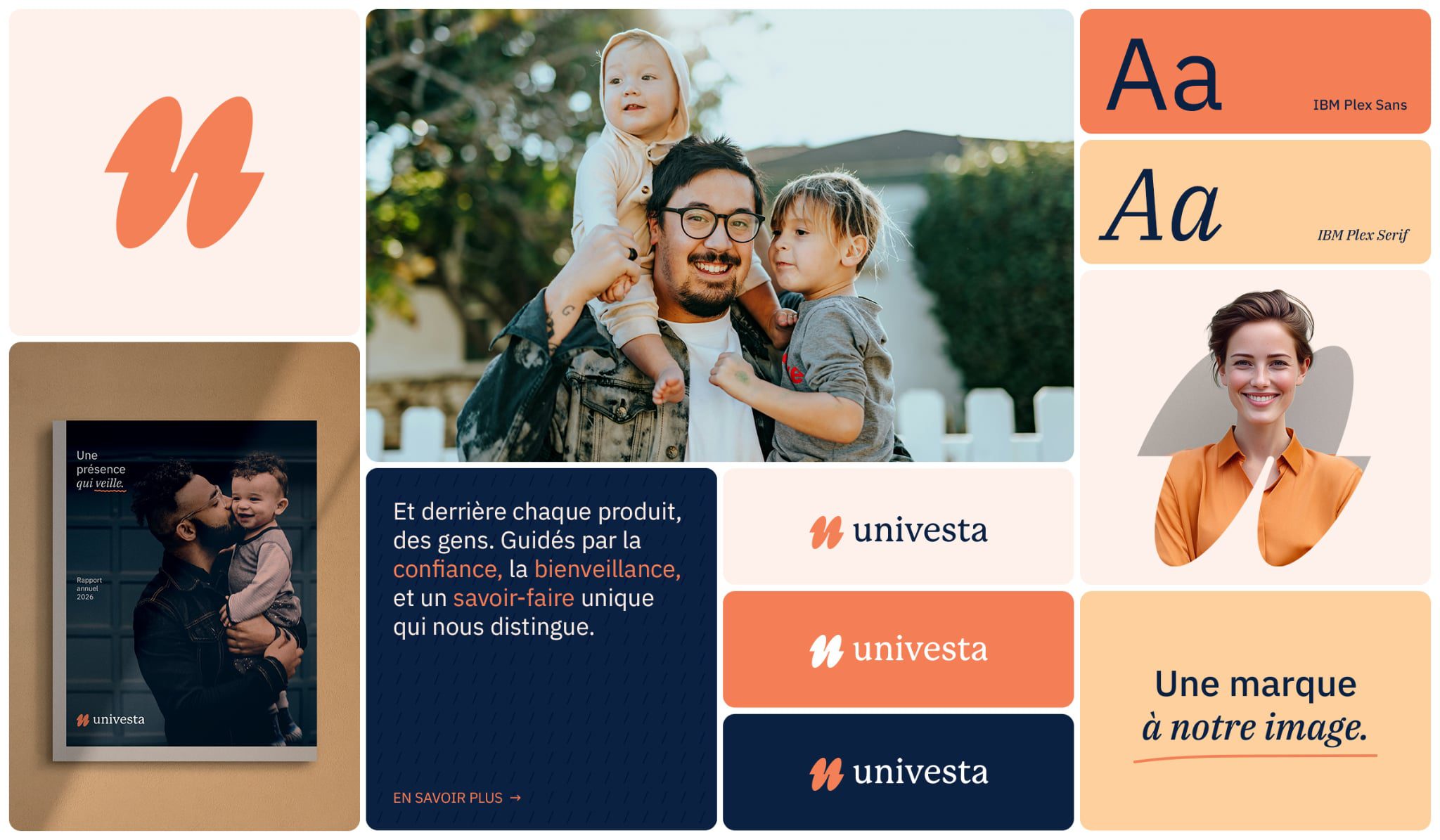
The new visual system introduces a more fluid, more expressive language while keeping the markers of credibility the industry expects.
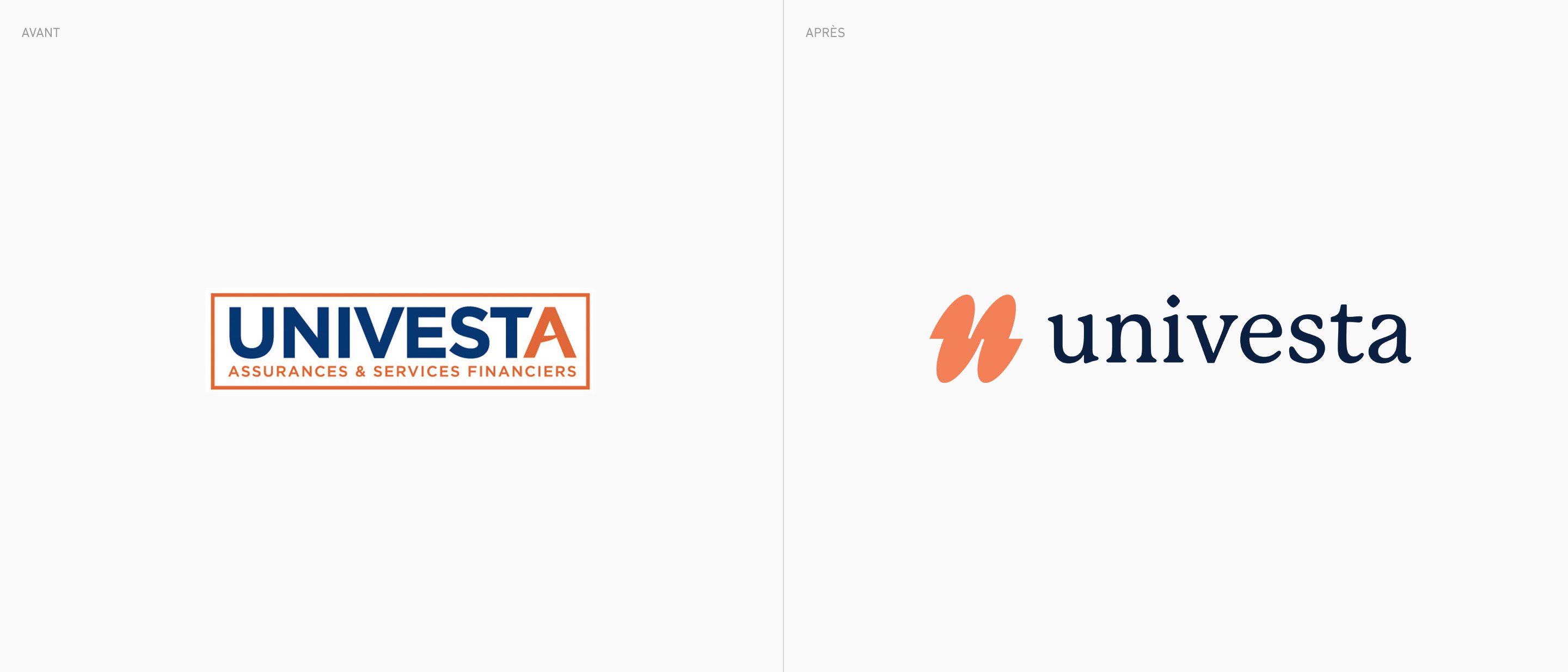
The symbol is built from the letters U and A, whose relationship evolves toward a more abstract, more alive form. This gesture creates a sense of movement and continuity, suggesting connection and support rather than a fixed structure.
Macadam Marketing is second to none when it comes to marketing, client service and quality of execution! At Univesta, we wanted to evolve our brand image and sharpen our market positioning, and the agency guided us through the process with a level of commitment that far exceeded our expectations. The team impressed us with the depth of their market analysis, their thoughtful recommendations, their exceptional attention to detail and the calibre of their external partners. Beyond their expertise, it was their responsiveness, their willingness to listen and their passion that made our experience truly unique. This is undoubtedly the beginning of a lasting partnership!
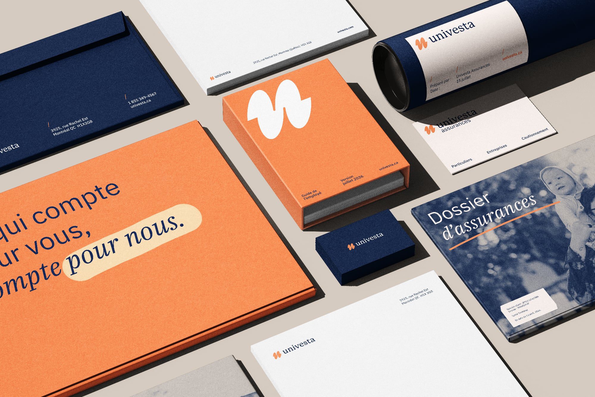
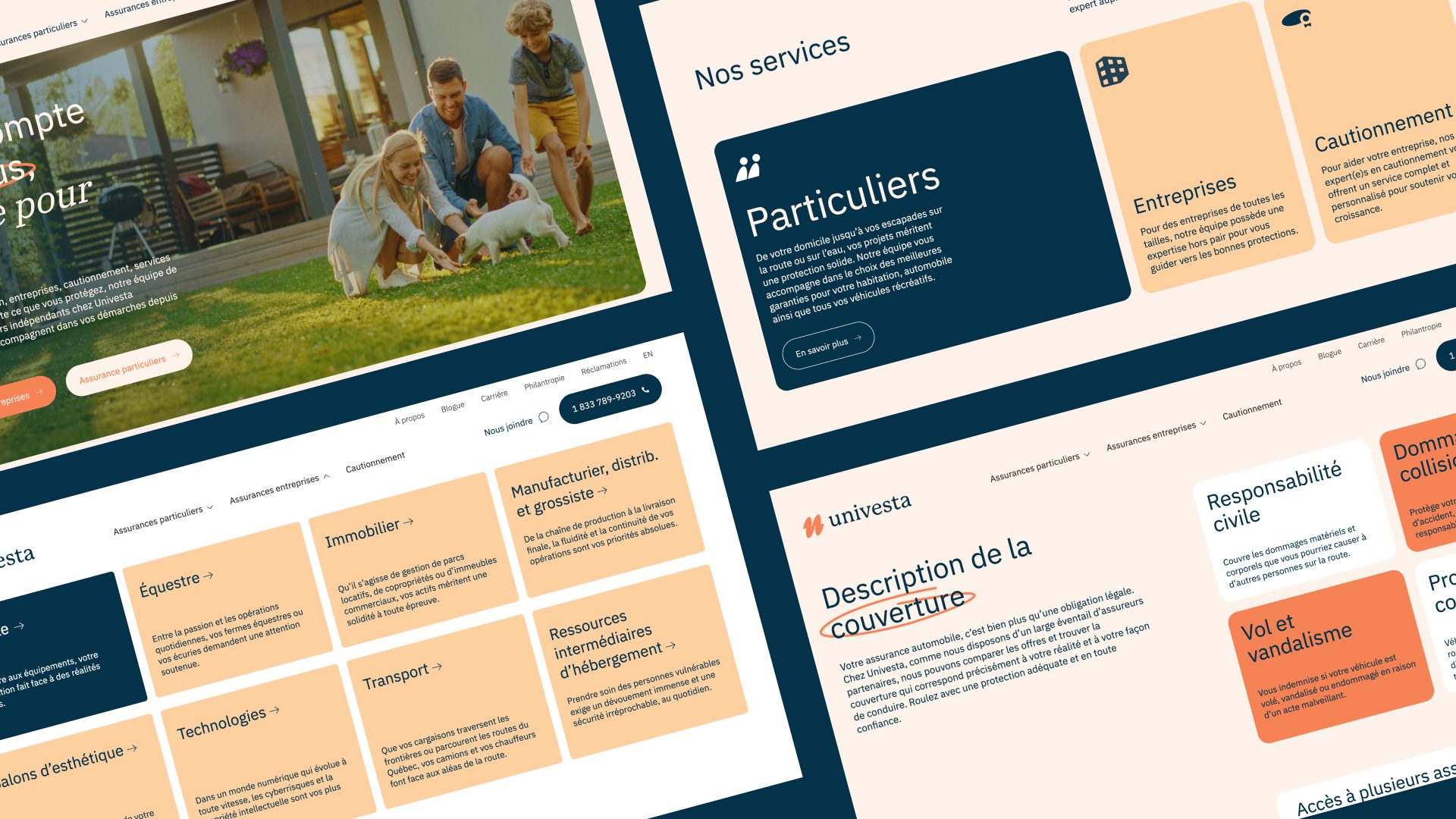
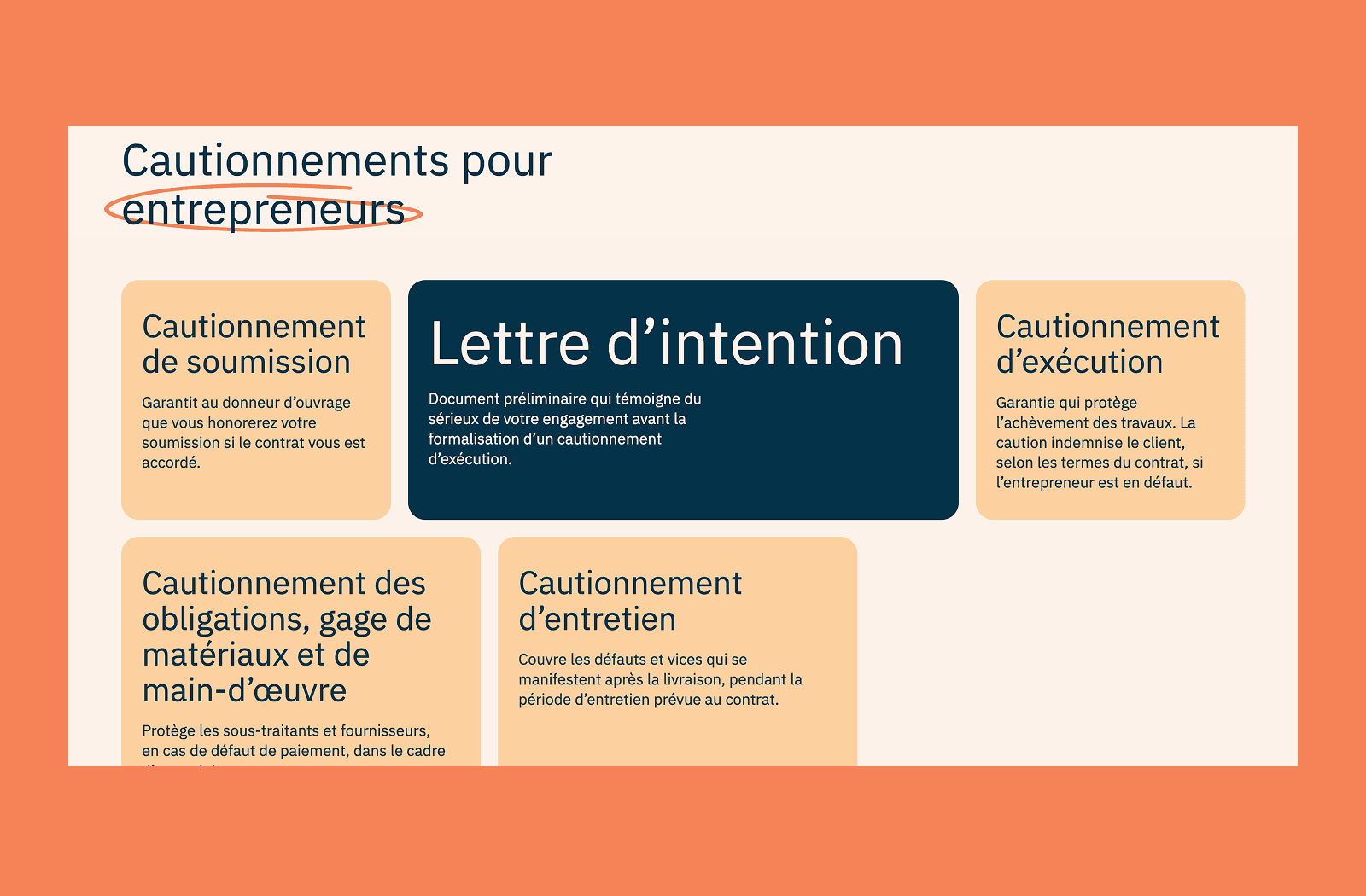
The typography plays on contrast, reflecting the duality that structures the new identity: rigor and closeness, expertise and humanity. The lowercase treatment and rounded shapes make for a more human, less institutional read. True to the brand’s foundations, the palette keeps blue and orange while adjusting their tones for more subtlety, warmth and modernity.
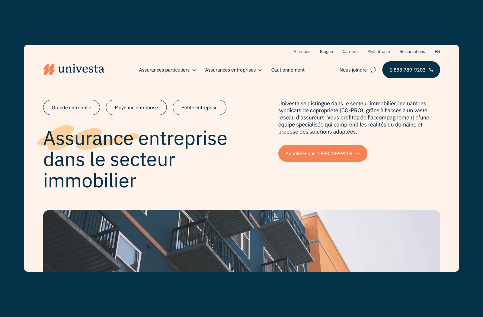
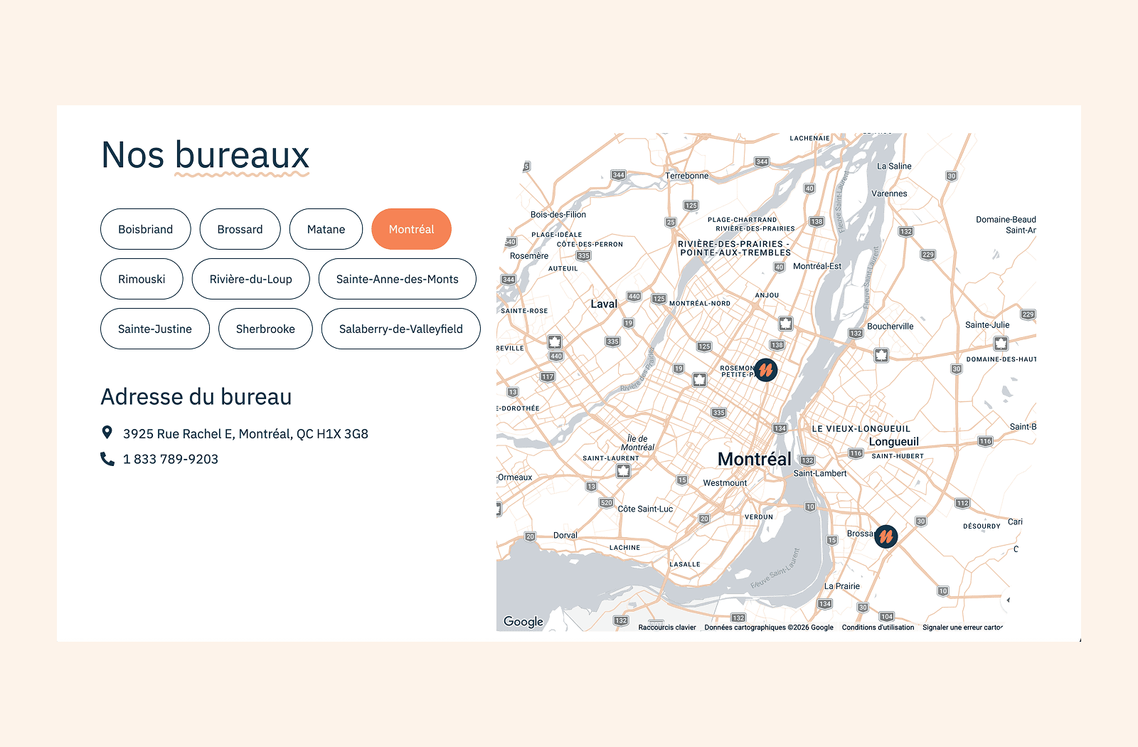
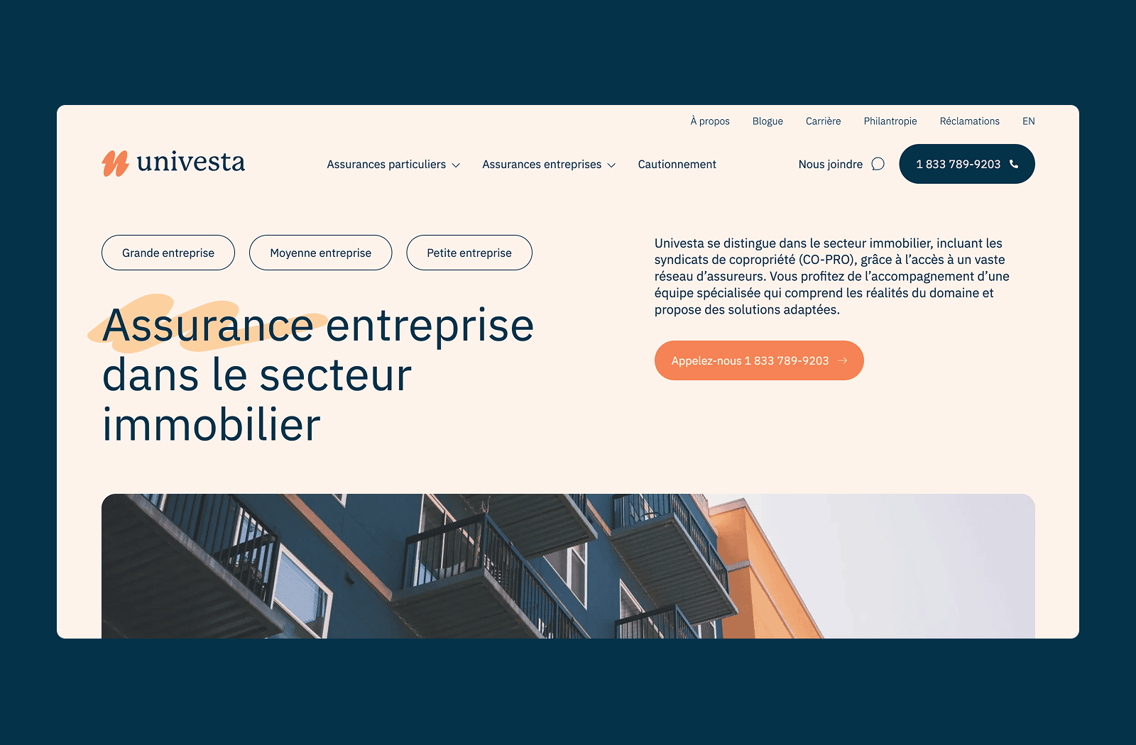
The website was produced in collaboration with web agency TREIZE, a longtime partner of Macadam.